In 2022, Canerector will celebrate its 75th anniversary. To honour our heritage, we felt it was an appropriate time to refresh our logo.
To understand how our logo evolved to where it is today, we must first look back to its origins. Rooted in historical significance, the logo’s evolution is one that has a unique story of founding respect and industry appreciation. Canerector’s founder, Stan Hawkins, first unveiled the diamond-shaped Canerector logo with the letters C.E. in the early 1950s, and that logo has withstood the test of time.
Bold Arrival – How It Began
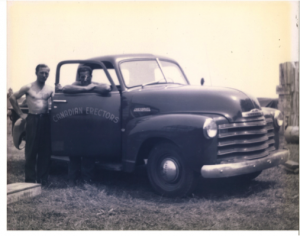
Living its early years as a package boiler company, the company name Canadian Erectors was born out of practicality. Our original partners were members of a field crew when their employer decided to exit the market. The previous employer gave this team the construction tools and equipment, which were stamped “CE.” The partners chose the name “Canadian Erectors” to avoid rebranding the equipment.
In the early days of the company, to establish familiarity, the name was simply spelled out. The only flight of fancy the company allowed itself was to arrange the letters in an arch. In retrospect, the logo was prescient, proving a foretaste of things to come. Arches are structures with deep resonance, and have been used in architecture and various designs. They embody and symbolize many things, such as efficiency, strength, and sturdiness – traits that Canerector values.
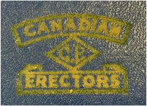
Stan Hawkins, an avid aviator, readied Canerector for its next flight as they opened a plant in Montreal. With the inauguration of the new plant in Montreal, there came the need for an appealing logo that would situate Canadian Erectors as a force to be reckoned with.
A second iteration of the logo emerged, with Canadian Erectors forming a banner around a diamond shape that hosted the letters C.E.
Stan’s son, Cecil Hawkins, explains, “The original partners had much respect for the company that gave them the tools.” He also adds, “The best form of flattery is to mimic someone, and so I think choosing the letters C.E. was almost aspirational.”
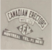
Canadian Erectors, at the time, were comprised of two arms – the manufacturing side and the construction site. As such, a parallel logo was created with the letters CEM.
As for the diamond, Cecil admits, “It was very cool for the time.” Undoubtedly the most distinctive part of the logo, the diamond shape, was almost futuristic. Stan Hawkins was an exceptional draftsman who could prepare detailed technical drawings by hand. Cecil presumes this skill may have been convenient in designing this new logo. “If I had to say, my father probably made this design on a whim to add a little pizzazz.” Cecil remembers fondly, “For the time, he was very avant-garde and had a unique eye for design.”
Canerector Takes Flight – Logo Expansion
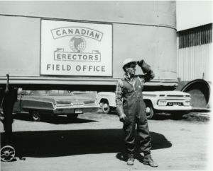
While Canadian Erectors’ creation was silent, the noise of their growth would soon spread through Montreal. When translated in French, Les Érecteurs Canadiens Ltée., the company name alone caused many eyebrows to be raised. The name often was greeted with an irreverent laugh as if the name would insinuate what knowing people called a “double entendre.” Cecil recalls holding back his laughter, “I was asked to go for a meeting with the newspapers in Montreal, where one gentleman demanded that we change the company name because they couldn’t say it aloud on the radio.”

This was one of the two instances Cecil recalls when Canadian Erectors were asked to change their name. The second request to change the name was more severe and ultimately dictated the removal of CE as its initials.
Cecil Hawkins remembers a dinner table conversation like it was yesterday regarding the company’s brand and logo, “I think Canadian Erectors was outgrowing its earlier image and was emerging as a large industry player which was causing some existing businesses to take notice. It was also clear that we needed a new name and a logo.”
Once again, Stan took it upon himself to reinvent Canadian Erectors and set his sight to expand the business beyond Canadian borders. His vision came to life with the unveiling of the new logo. The logo featured a globe with Canadian Erectors written in red, forming an arch above and below the globe.
Having served as a navigator during World War II, the red lettering may have been a deliberate choice by Stan. The logo seemed to have combined Stan’s love for his country, his passion for exploring the world and his vision to expand his company in one intricate design.
Canerector Soars to New Heights
Stan’s vision began to take flight when Cecil Hawkins, a young law student, decided to join the family business. Cecil brought a fresh new perspective and renewed zeal to make his father’s visions a reality, beginning with small acquisitions.

Signalling Cecil’s arrival and commitment, a new logo was launched to communicate the company’s straightforward approach. This time Cecil opted for a bold typeface that read Canadian Erectors with slants up and down.

However, this iteration was short-lived as the number of businesses and locations grew, necessitating a holding company to join the group together. Cecil recalls, “Back in the days, we used to have a telex machine, much like a telegram, which could not utilize two words for a business. We had to have one word, and to accommodate that, I merged the two names.” Inspired by this, the holding company known today as Canerector Inc. was born. Cecil focused on our core attributes of simplicity and practicality and chose a font-based logo designed by a graphic artist in the 1980’s that simply focused on Canerector’s name.
The Future Remembers – Today’s Logo
In 2021, the company was approaching its 75th year, and this felt like a perfect time to refresh our look. “It was important for the logo to honour our history though also show our presence today as a leading industrial design and manufacturing company across North America”, says Amanda Hawkins, current Canerector CEO.
After considering many options it became clear by unanimous vote that the original logo, designed by Stan, was the perfect place to start. With some twists and updates, this iconic and recognizable diamond shape with the letters CE honoured their heritage yet gave them a brand new mark.
In crafting their new identity, it is evident that Canerector wanted to maintain the original dark blue colour that weaved through the previous company logos. Though this time, it is set on a metallic background, reminding us of a nameplate one might find on equipment. The aim was to speak to metal and the breadth of industrial products that tie the Canerector businesses together.

As for the font, named Industrial Inc., Amanda explains, “the choice was inspired by fonts used in names and adverts of old manufacturing plants and warehouses. It’s great to see these restored or repurposed buildings, and the font reminded me of the history and prominence of the manufacturing industry.”
Today’s new logo is a combination of this font and the renewed take on the old logo design. It is an image that honours Canerector’s historical roots along with the current strength and ingenuity of our businesses.


